Encouraging creativity and inventiveness
The Pantone Colour of the Year reflects what's happening in our global culture. It expresses what people are looking for and tries to respond to it. The complexity of this new blue hue infused with red violet highlights the vast possibilities," says Leatrice Eiseman, executive director of the Pantone Color Insitute.

How can you adopt it at home?
Very Peri Blue combines the fidelity and consistency of blue with the energy and enthusiasm of red. A colour that expresses a lively and joyful attitude and a dynamic presence that encourages courageous creativity and imaginative expression, she says.
.The decorating trends reflect a thirst for renewal and fantasy in interiors. The focus is on colour and a return to colourful harmonies to brighten up our daily lives, which have been turned upside down by current events. Very Peri helps us embrace our changing environment by encouraging creativity and inventiveness to open up new perspectives.

A dynamism in our interiors.
Very Peri can be combined with many classic and neutral shades such as black-grey-white for a timeless and sophisticated interior, or more cheerful shades of pink, yellow or orange for the more daring.
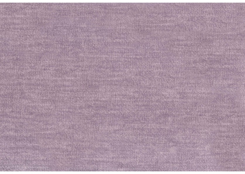
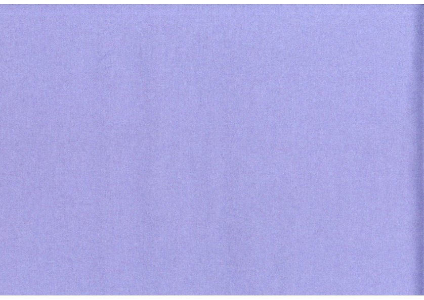
Discover in our range of plain or patterned fabrics allowing you to use Very Peri and its variations sparingly or more audaciously.